


In this blog post series, we’re going to compare two Data Visualization packages in the Python landscape. We will create a bar chart from dummy data, based on this example available in the Altair documentation, with each package. Furthermore, we will try to follow the most straightforward implementation to compare the two APIs/charts from their defaults.
For this first installment, let’s create a bar chart using Altair and then leather. The dataset looks like this:
<span>import</span> <span>pandas</span> <span>as</span> <span>pd</span><span>source</span> <span>=</span> <span>pd</span><span>.</span><span>DataFrame</span><span>(</span><span>{</span><span>"a"</span><span>:</span> <span>[</span><span>"A"</span><span>,</span> <span>"B"</span><span>,</span> <span>"C"</span><span>,</span> <span>"D"</span><span>,</span> <span>"E"</span><span>,</span> <span>"F"</span><span>,</span> <span>"G"</span><span>,</span> <span>"H"</span><span>,</span> <span>"I"</span><span>],</span><span>"b"</span><span>:</span> <span>[</span><span>28</span><span>,</span> <span>55</span><span>,</span> <span>43</span><span>,</span> <span>91</span><span>,</span> <span>81</span><span>,</span> <span>53</span><span>,</span> <span>19</span><span>,</span> <span>87</span><span>,</span> <span>52</span><span>],</span><span>}</span><span>)</span><span>import</span> <span>pandas</span> <span>as</span> <span>pd</span> <span>source</span> <span>=</span> <span>pd</span><span>.</span><span>DataFrame</span><span>(</span> <span>{</span> <span>"a"</span><span>:</span> <span>[</span><span>"A"</span><span>,</span> <span>"B"</span><span>,</span> <span>"C"</span><span>,</span> <span>"D"</span><span>,</span> <span>"E"</span><span>,</span> <span>"F"</span><span>,</span> <span>"G"</span><span>,</span> <span>"H"</span><span>,</span> <span>"I"</span><span>],</span> <span>"b"</span><span>:</span> <span>[</span><span>28</span><span>,</span> <span>55</span><span>,</span> <span>43</span><span>,</span> <span>91</span><span>,</span> <span>81</span><span>,</span> <span>53</span><span>,</span> <span>19</span><span>,</span> <span>87</span><span>,</span> <span>52</span><span>],</span> <span>}</span> <span>)</span>import pandas as pd source = pd.DataFrame( { "a": ["A", "B", "C", "D", "E", "F", "G", "H", "I"], "b": [28, 55, 43, 91, 81, 53, 19, 87, 52], } )
Enter fullscreen mode Exit fullscreen mode
From the source above, we can define a bar chart in Altair via the following snippet:
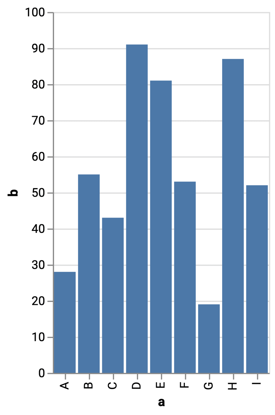
<span>import</span> <span>altair</span> <span>as</span> <span>alt</span><span>alt</span><span>.</span><span>Chart</span><span>(</span><span>source</span><span>).</span><span>mark_bar</span><span>().</span><span>encode</span><span>(</span><span>x</span><span>=</span><span>"a"</span><span>,</span> <span>y</span><span>=</span><span>"b"</span><span>)</span><span>import</span> <span>altair</span> <span>as</span> <span>alt</span>

<span>alt</span><span>.</span><span>Chart</span><span>(</span><span>source</span><span>).</span><span>mark_bar</span><span>().</span><span>encode</span><span>(</span><span>x</span><span>=</span><span>"a"</span><span>,</span> <span>y</span><span>=</span><span>"b"</span><span>)</span>import altair as alt

alt.Chart(source).mark_bar().encode(x="a", y="b")
Enter fullscreen mode Exit fullscreen mode
When we run the snippet above, we get the result below:
Now, using leather, we get a similar bar chart as follows:
<span>import</span> <span>leather</span><span>chart</span> <span>=</span> <span>leather</span><span>.</span><span>Chart</span><span>()</span><span># We cannot use a pandas DataFrame directly. </span><span>chart</span><span>.</span><span>add_columns</span><span>(</span><span>data</span><span>=</span><span>source</span><span>.</span><span>to_records</span><span>(</span><span>index</span><span>=</span><span>False</span><span>).</span><span>tolist</span><span>())</span><span>chart</span><span>.</span><span>to_svg</span><span>()</span><span>import</span> <span>leather</span>

<span>chart</span> <span>=</span> <span>leather</span><span>.</span><span>Chart</span><span>()</span>

<span># We cannot use a pandas DataFrame directly. </span><span>chart</span><span>.</span><span>add_columns</span><span>(</span><span>data</span><span>=</span><span>source</span><span>.</span><span>to_records</span><span>(</span><span>index</span><span>=</span><span>False</span><span>).</span><span>tolist</span><span>())</span>

<span>chart</span><span>.</span><span>to_svg</span><span>()</span>import leather

chart = leather.Chart()

# We cannot use a pandas DataFrame directly. chart.add_columns(data=source.to_records(index=False).tolist())

chart.to_svg()
Enter fullscreen mode Exit fullscreen mode

Comparing the two (default) outputs, we can highlight a number of differences:
- The default width is larger with leather. As a result, the bars are also wider.
- In leather, the bars are red (
#e41a1c), compared to blue in Altair. - The bar chart created with leather does not show titles for the axes, unlike Altair.
- There is no axis line on the Y-axis in leather. On the X-axis, the labels are not rotated (0°).
- In Altair, there are only horizontal gridlines. In the case of leather, there are horizontal and vertical ones.
- The default fonts are different. In leather, Monaco is used.
- The background colors are also different. In Altair, the background color is white, while in leather, it is a (very) light gray (
#f9f9f9).
On the other hand, for the Y-axis, both charts present a scale with the same domain, ending in a nice round value (100). However, the number of ticks is different.
Finally, if you have any questions or suggestions, feel free to leave a comment below!


暂无评论内容