


Do you feel exciting with Pie Chart that you learned in High School but struggling to work in Matplotlib? Well, In this tutorial we are going to have a look at this very popular type of chart plotting. Let’s begin.
First, we need to import pyplot,then we just took a list called slices and plotted the info using plt.pie() function.:
import matplotlib.pyplot as pltplt.style.use('fivethirtyeight')slices = [60,40]plt.pie(slices)plt.title('My Demo pie chart')plt.tight_layout()plt.savefig('pie1.png')plt.show()import matplotlib.pyplot as plt
plt.style.use('fivethirtyeight')
slices = [60,40]
plt.pie(slices)
plt.title('My Demo pie chart')
plt.tight_layout()
plt.savefig('pie1.png')
plt.show()import matplotlib.pyplot as plt
plt.style.use('fivethirtyeight')
slices = [60,40]
plt.pie(slices)
plt.title('My Demo pie chart')
plt.tight_layout()
plt.savefig('pie1.png')
plt.show()
The output looks like this:
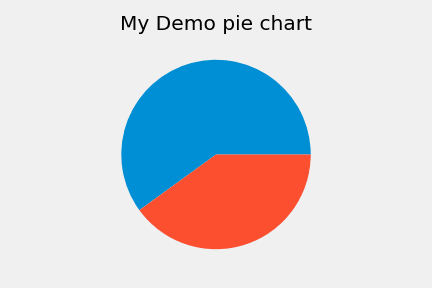
Though this graph has been divided into two sections but we can not get any further information from this. So, we can add labels to this.
import matplotlib.pyplot as pltplt.style.use('fivethirtyeight')slices = [60,40]labeling = ['sixty','forty']plt.pie(slices,labels=labeling)plt.title('My Demo pie chart')plt.tight_layout()plt.show()import matplotlib.pyplot as plt
plt.style.use('fivethirtyeight')
slices = [60,40]
labeling = ['sixty','forty']
plt.pie(slices,labels=labeling)
plt.title('My Demo pie chart')
plt.tight_layout()
plt.show()import matplotlib.pyplot as plt
plt.style.use('fivethirtyeight')
slices = [60,40]
labeling = ['sixty','forty']
plt.pie(slices,labels=labeling)
plt.title('My Demo pie chart')
plt.tight_layout()
plt.show()
To add labels, we’ve just assigned the strings we want to add as labels in a variable named labeling and passed it through the plt.pie() function. The output looks like this:
![图片[1]-Exploring the Basics of Pie Chart in Matplotlib - 拾光赋-拾光赋](https://res.cloudinary.com/practicaldev/image/fetch/s--rMQdwI_a--/c_limit%2Cf_auto%2Cfl_progressive%2Cq_auto%2Cw_880/https://dev-to-uploads.s3.amazonaws.com/i/wlihyj0bfxn3qh4r5nva.png)
we can also add an edge or border covering the whole circle and on the section line. To add this, we just need to pass wedgeprops={'edgecolor':'yellow'} as an additional parameter where the color is also defined.
plt.pie(slices,labels=labeling,wedgeprops={'edgecolor':'yellow'})plt.title('My Demo pie chart')plt.tight_layout()plt.show()plt.pie(slices,labels=labeling,wedgeprops={'edgecolor':'yellow'})
plt.title('My Demo pie chart')
plt.tight_layout()
plt.show()plt.pie(slices,labels=labeling,wedgeprops={'edgecolor':'yellow'})
plt.title('My Demo pie chart')
plt.tight_layout()
plt.show()
the output:
![图片[2]-Exploring the Basics of Pie Chart in Matplotlib - 拾光赋-拾光赋](https://res.cloudinary.com/practicaldev/image/fetch/s--PE71C1dS--/c_limit%2Cf_auto%2Cfl_progressive%2Cq_auto%2Cw_880/https://dev-to-uploads.s3.amazonaws.com/i/kd9dyhk8jq628gls4it9.png)
We can also play with different colors in this graph:
plt.style.use('fivethirtyeight')slices = [60,40,30,20]labeling = ['sixty','forty','thirty','twenty']colorss = ['yellow','blue','red','green']plt.pie(slices,labels=labeling,colors=colorss,wedgeprops={'edgecolor':'black'})plt.title('My Demo pie chart')plt.tight_layout()plt.show()plt.style.use('fivethirtyeight')
slices = [60,40,30,20]
labeling = ['sixty','forty','thirty','twenty']
colorss = ['yellow','blue','red','green']
plt.pie(slices,labels=labeling,colors=colorss,wedgeprops={'edgecolor':'black'})
plt.title('My Demo pie chart')
plt.tight_layout()
plt.show()plt.style.use('fivethirtyeight')
slices = [60,40,30,20]
labeling = ['sixty','forty','thirty','twenty']
colorss = ['yellow','blue','red','green']
plt.pie(slices,labels=labeling,colors=colorss,wedgeprops={'edgecolor':'black'})
plt.title('My Demo pie chart')
plt.tight_layout()
plt.show()
To add this, we need to pass additional parameters like colorss variable which contains the colors we will add here as strings. Notice, before this, we’ve also added two extra parameters in our slices variable and took an extra variable named labeling which is also passed to plt.pie() function. Now if we run this, we will see:
![图片[3]-Exploring the Basics of Pie Chart in Matplotlib - 拾光赋-拾光赋](https://res.cloudinary.com/practicaldev/image/fetch/s--ktB34LLs--/c_limit%2Cf_auto%2Cfl_progressive%2Cq_auto%2Cw_880/https://dev-to-uploads.s3.amazonaws.com/i/dbcejdqmys6sknq43n4p.png)
Emphasizing:
we can also emphasize a particular slice in our pie chart by using the explode.
plt.style.use('fivethirtyeight')slices = [59219, 55466, 47544, 36443, 35917]labels = ['JavaScript', 'HTML/CSS', 'SQL', 'Python', 'Java']explode = [0,0,0,0.1,0]plt.pie(slices,labels=labels,explode=explode,wedgeprops={'edgecolor':'black'})plt.title('My Demo pie chart')plt.tight_layout()plt.show()plt.style.use('fivethirtyeight')
slices = [59219, 55466, 47544, 36443, 35917]
labels = ['JavaScript', 'HTML/CSS', 'SQL', 'Python', 'Java']
explode = [0,0,0,0.1,0]
plt.pie(slices,labels=labels,explode=explode,wedgeprops={'edgecolor':'black'})
plt.title('My Demo pie chart')
plt.tight_layout()
plt.show()plt.style.use('fivethirtyeight')
slices = [59219, 55466, 47544, 36443, 35917]
labels = ['JavaScript', 'HTML/CSS', 'SQL', 'Python', 'Java']
explode = [0,0,0,0.1,0]
plt.pie(slices,labels=labels,explode=explode,wedgeprops={'edgecolor':'black'})
plt.title('My Demo pie chart')
plt.tight_layout()
plt.show()
in the explode variable we have some values denoting which circle to be exploded by how much. Like, we’ve set here the 4th value to be 0.1 which means the slice of python will be exploded in our chart. Let’s see the output to understand:
![图片[4]-Exploring the Basics of Pie Chart in Matplotlib - 拾光赋-拾光赋](https://res.cloudinary.com/practicaldev/image/fetch/s--kwmrtv01--/c_limit%2Cf_auto%2Cfl_progressive%2Cq_auto%2Cw_880/https://dev-to-uploads.s3.amazonaws.com/i/m7if393dwqflh0hr4pny.png)
We can also add a shadow on this and rotate the chart by some margins. To do this, we need to pass shadow and startangle attributes with values as parameters to the plt.pie() function.Code for this:
plt.style.use('fivethirtyeight')slices = [59219, 55466, 47544, 36443, 35917]labels = ['JavaScript', 'HTML/CSS', 'SQL', 'Python', 'Java']explode = [0,0,0,0.1,0]plt.pie(slices,labels=labels,explode=explode,shadow=True,startangle=90,wedgeprops={'edgecolor':'black'})plt.title('My Demo pie chart')plt.tight_layout()plt.show()plt.style.use('fivethirtyeight')
slices = [59219, 55466, 47544, 36443, 35917]
labels = ['JavaScript', 'HTML/CSS', 'SQL', 'Python', 'Java']
explode = [0,0,0,0.1,0]
plt.pie(slices,labels=labels,explode=explode,shadow=True,startangle=90,wedgeprops={'edgecolor':'black'})
plt.title('My Demo pie chart')
plt.tight_layout()
plt.show()plt.style.use('fivethirtyeight')
slices = [59219, 55466, 47544, 36443, 35917]
labels = ['JavaScript', 'HTML/CSS', 'SQL', 'Python', 'Java']
explode = [0,0,0,0.1,0]
plt.pie(slices,labels=labels,explode=explode,shadow=True,startangle=90,wedgeprops={'edgecolor':'black'})
plt.title('My Demo pie chart')
plt.tight_layout()
plt.show()
Output:
![图片[5]-Exploring the Basics of Pie Chart in Matplotlib - 拾光赋-拾光赋](https://res.cloudinary.com/practicaldev/image/fetch/s--_8FRtxO2--/c_limit%2Cf_auto%2Cfl_progressive%2Cq_auto%2Cw_880/https://dev-to-uploads.s3.amazonaws.com/i/urvbdrq2dq2nz8ih95yl.png)
So, we can see the python slice is rotated by 90 degrees and a light shadow in the graph.
A very common scenario we see is this kind of graph contains percentages on its slices. We can also add percentage by passing a parameter autopct='%1.1f%%' to the plt.pie() function which will display percentage up-to one digit after the decimal point. Let’s see the code and output:
plt.style.use('fivethirtyeight')slices = [59219, 55466, 47544, 36443, 35917]labels = ['JavaScript', 'HTML/CSS', 'SQL', 'Python', 'Java']explode = [0,0,0,0.1,0]plt.pie(slices,labels=labels,explode=explode,shadow=True,startangle=90,autopct='%1.1f%%',wedgeprops={'edgecolor':'black'})plt.title('My Demo pie chart')plt.tight_layout()plt.show()plt.style.use('fivethirtyeight')
slices = [59219, 55466, 47544, 36443, 35917]
labels = ['JavaScript', 'HTML/CSS', 'SQL', 'Python', 'Java']
explode = [0,0,0,0.1,0]
plt.pie(slices,labels=labels,explode=explode,shadow=True,startangle=90,autopct='%1.1f%%',wedgeprops={'edgecolor':'black'})
plt.title('My Demo pie chart')
plt.tight_layout()
plt.show()plt.style.use('fivethirtyeight')
slices = [59219, 55466, 47544, 36443, 35917]
labels = ['JavaScript', 'HTML/CSS', 'SQL', 'Python', 'Java']
explode = [0,0,0,0.1,0]
plt.pie(slices,labels=labels,explode=explode,shadow=True,startangle=90,autopct='%1.1f%%',wedgeprops={'edgecolor':'black'})
plt.title('My Demo pie chart')
plt.tight_layout()
plt.show()
Output:
![图片[6]-Exploring the Basics of Pie Chart in Matplotlib - 拾光赋-拾光赋](https://res.cloudinary.com/practicaldev/image/fetch/s--NvvTv4Jt--/c_limit%2Cf_auto%2Cfl_progressive%2Cq_auto%2Cw_880/https://dev-to-uploads.s3.amazonaws.com/i/b4zdkqv0j9ucsdtmwl26.png)
There it is! A standard Pie Chart representation.
Thank you all for being with me in this tutorial. See you next time with something more interesting. Stay Tuned.


暂无评论内容